If you continue to use this site, you consent to our use of cookies.
Helping an original .com to prosper
Hitting the .com scene in 2000, Moonpig was the first in the UK to bring presents and cheer to friends' and families' doors, without even having to leave the sofa to buy. The business and the people in it were brilliant, but the brand didn’t live up to the reality. When it was time to take the success of Moonpig to the next level and to IPO the business, naturally the brand would play a key role in the potential share price, so it was time to elevate it. The new brand was built around a simple idea: at Moonpig the normal rules don’t apply – life is lighter on the moon!
Moonpig peaked with a £1.2bn IPO in 2021 and we couldn’t be happier for them.
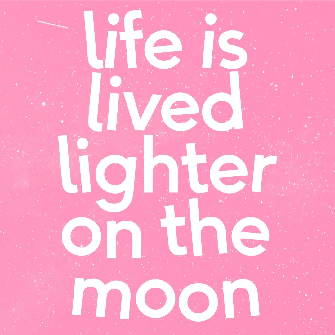
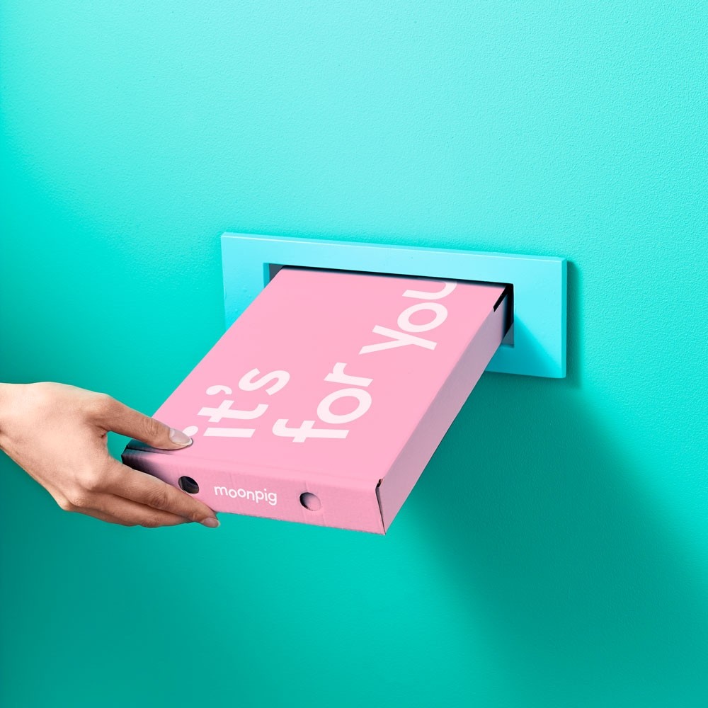
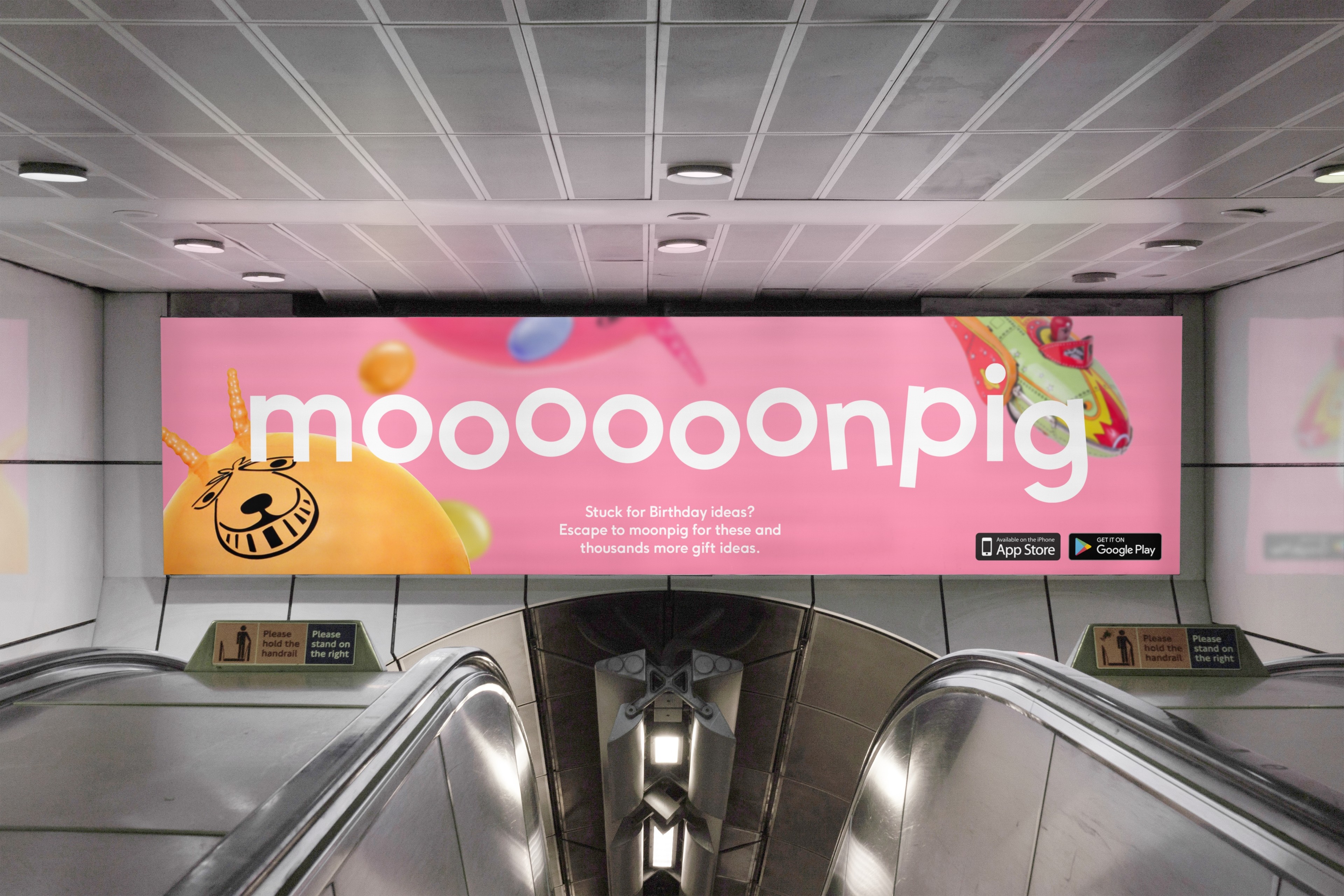
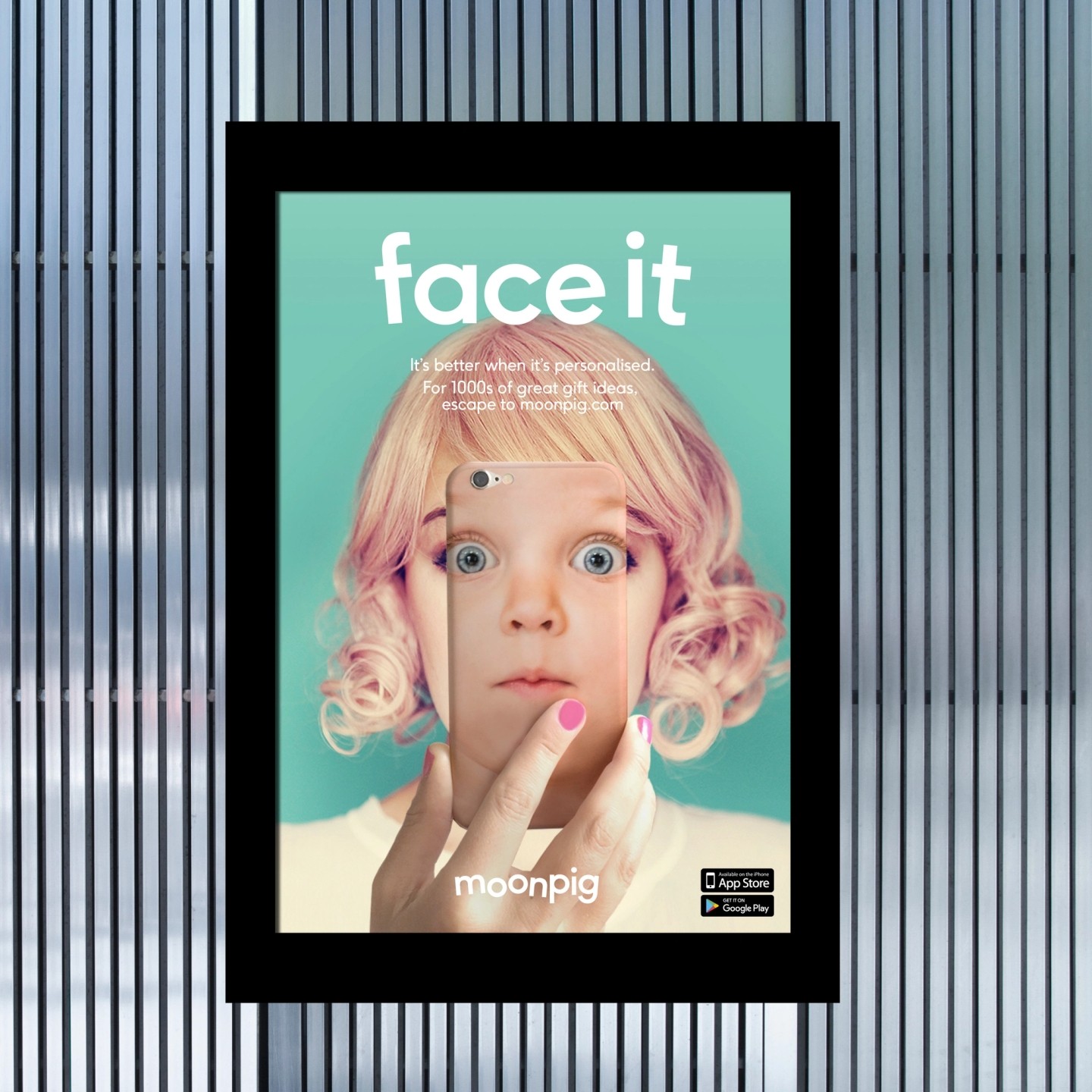
We joined together as one team and went in-house for key stages of the brand creation. The Moonpig team are different; they love what they do and approach life with fun and lightness. Life is Lighter on the Moon became the new creative idea to embody this, and a strong visual brand was needed to reflect it.
What we did
- Visual identity
- Art direction
- Implementation
- Engagement
Partners
- Strategy – Cat Totty
- Photography – Mitch Payne
- Writing – Phil Dudman
- Typography – F37
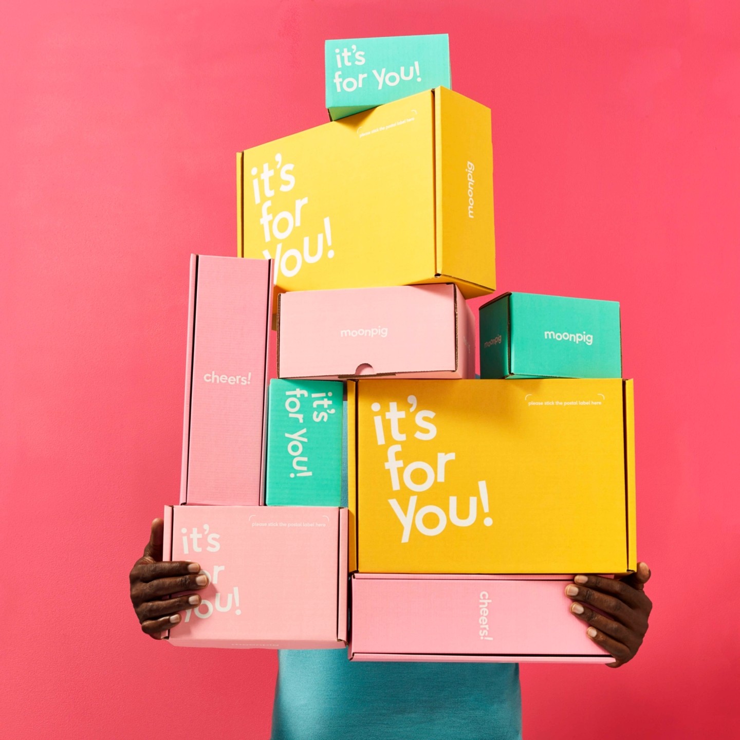
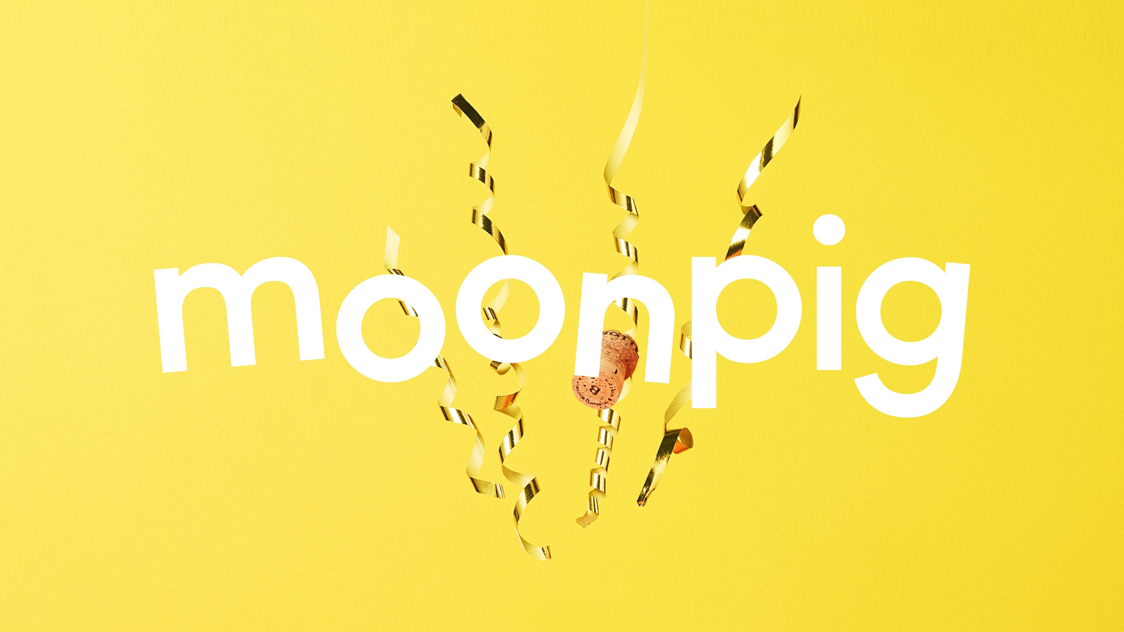
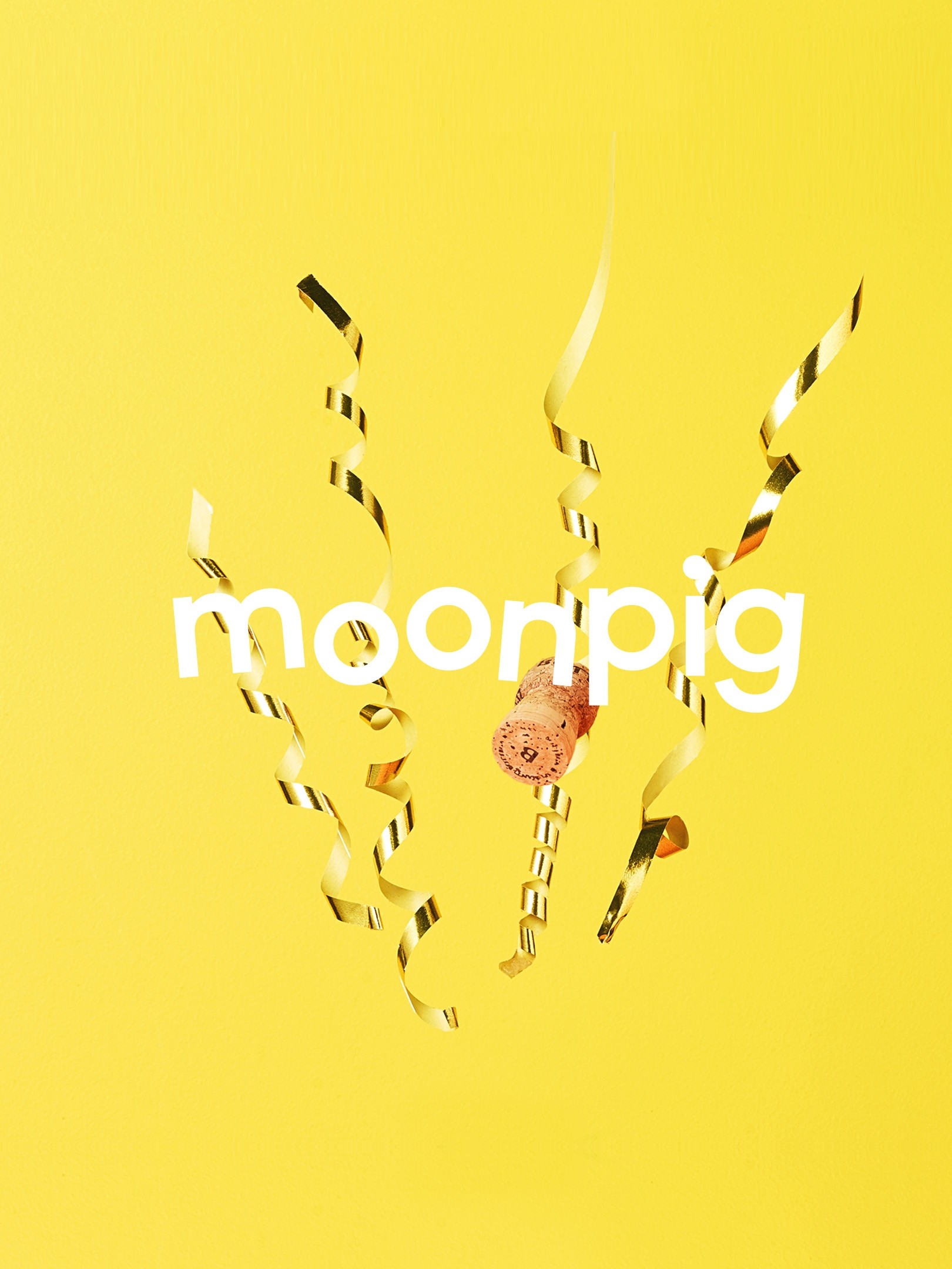
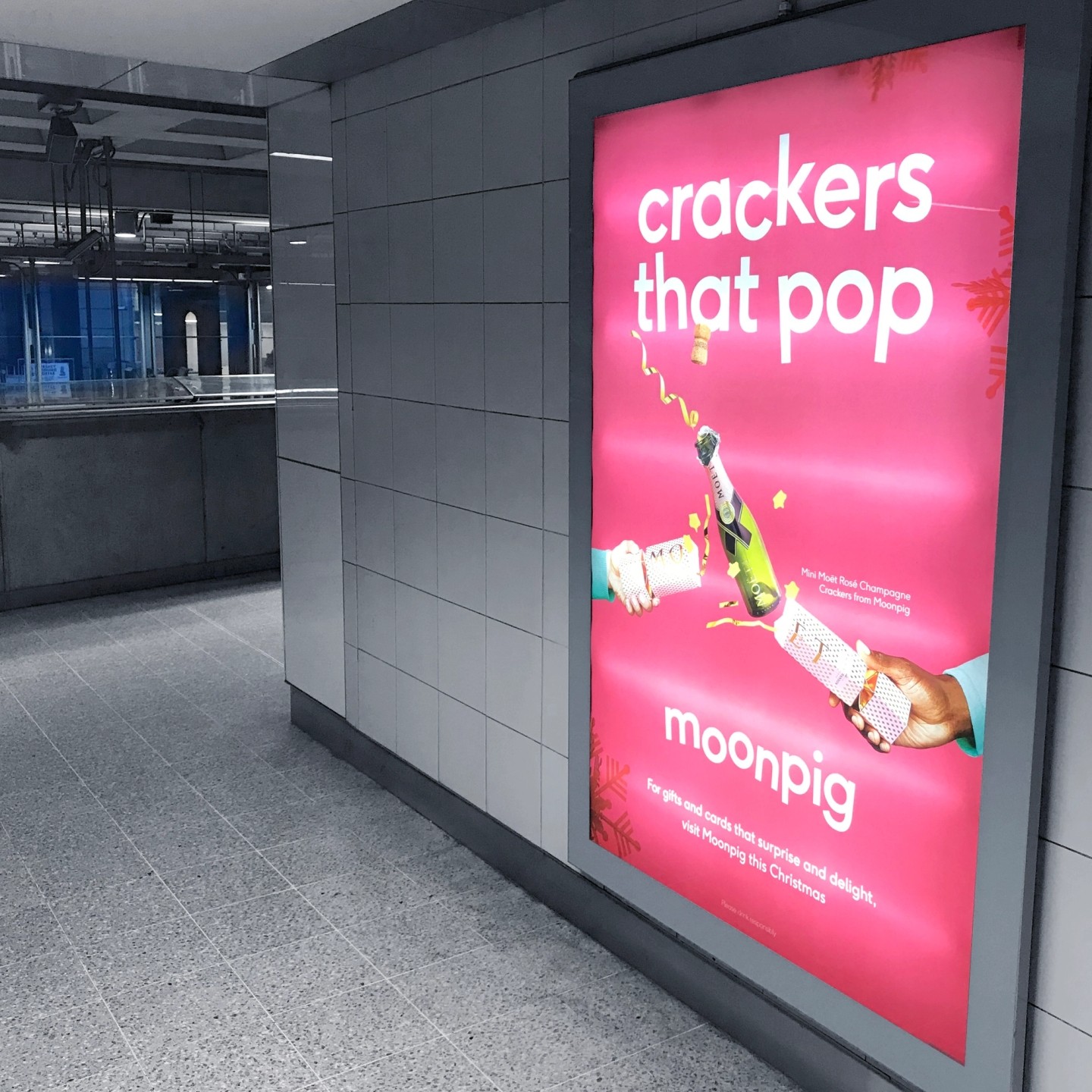
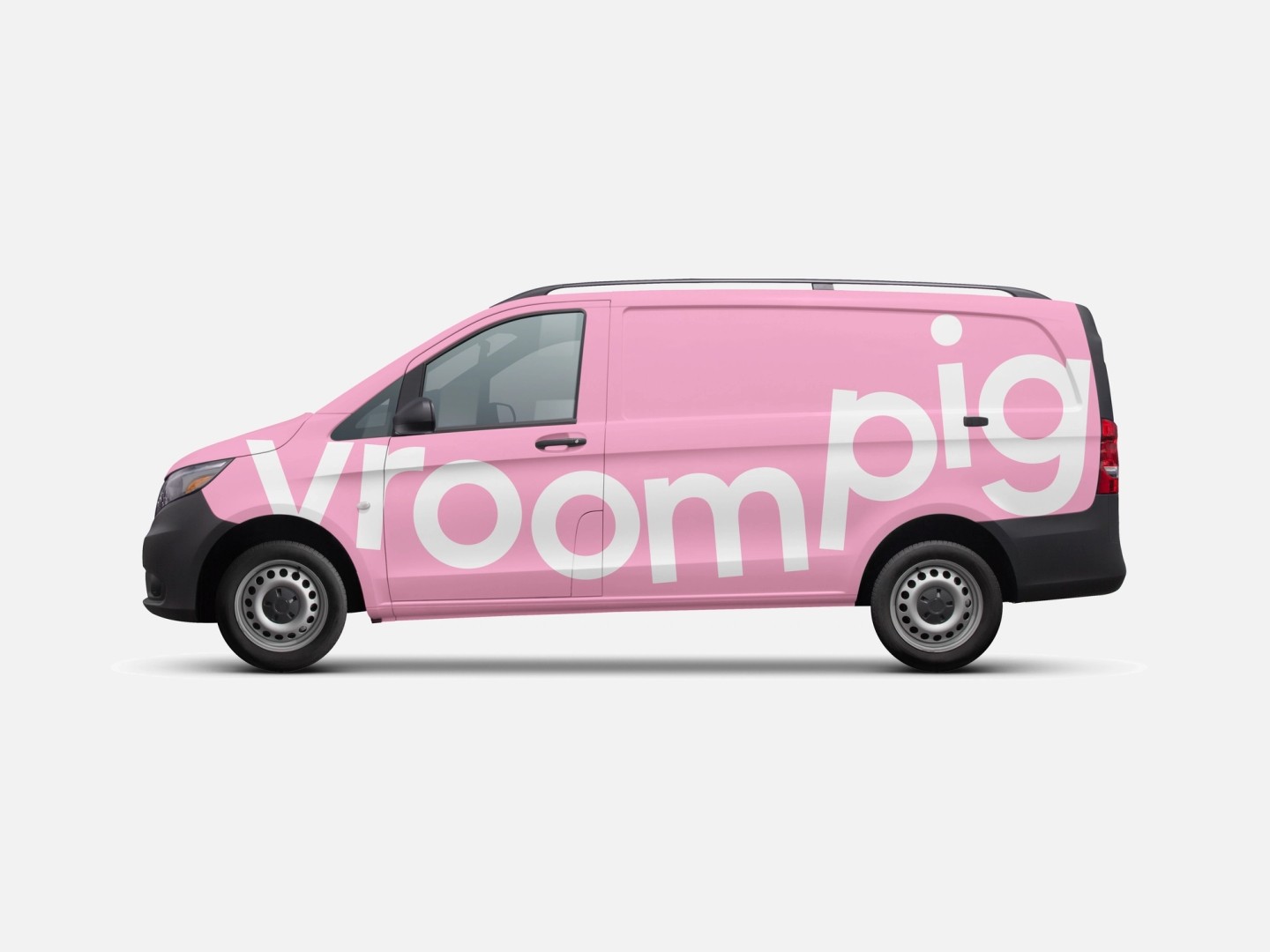
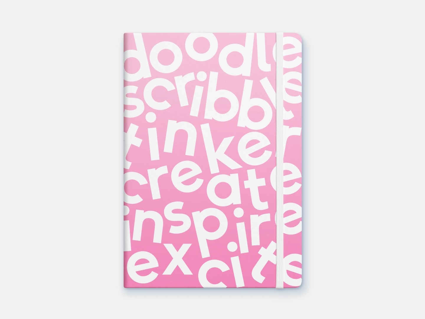
The logo was designed to capture the playful spirit. It compresses down to form a subtle reference to a pig's snout, for use in small spaces, and it extends out to allow play with horizontal formats and to interact with the new TV jingle. We worked with well-renowned type foundry F37 to create and develop a custom bespoke typeface, that would bring character and personality to the identity. The project went on to win a won wooden pencil at the D&AD awards.
The Brand signature
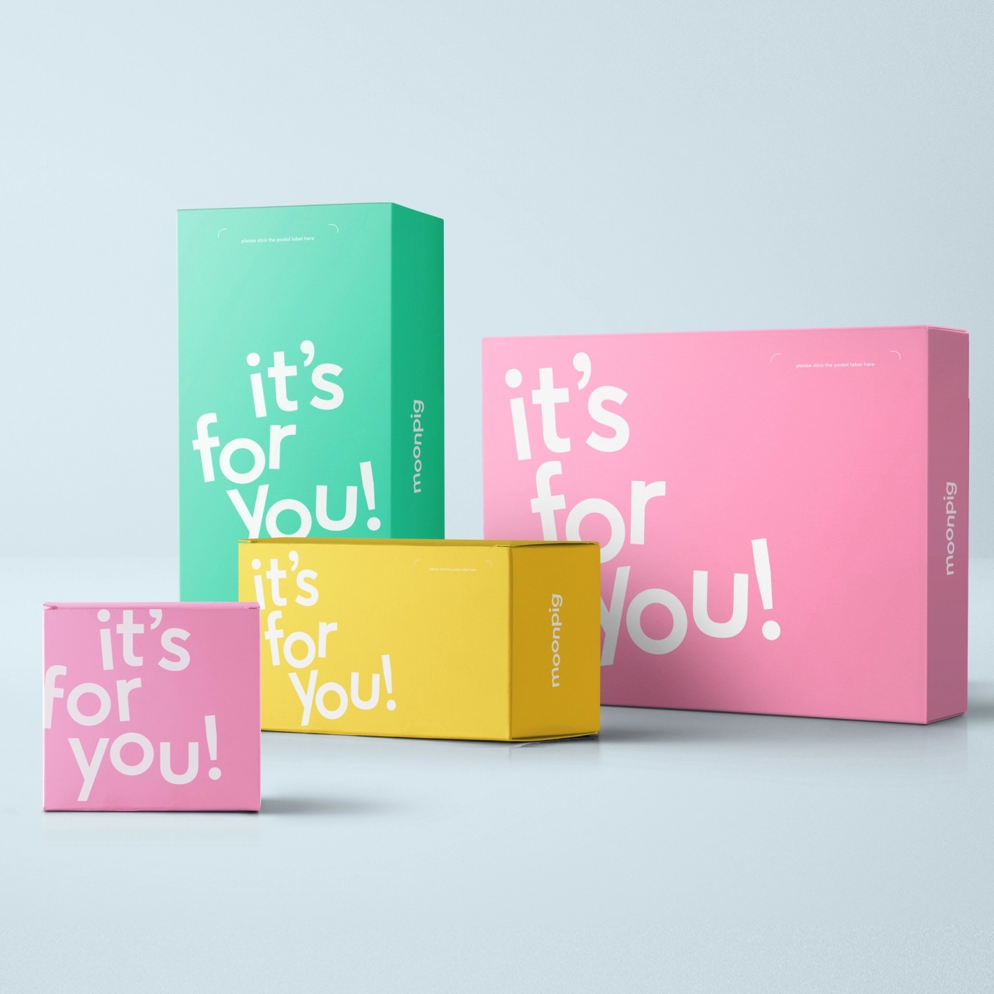
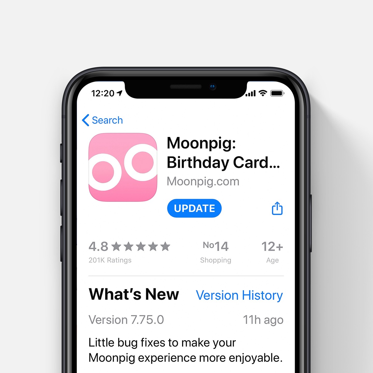
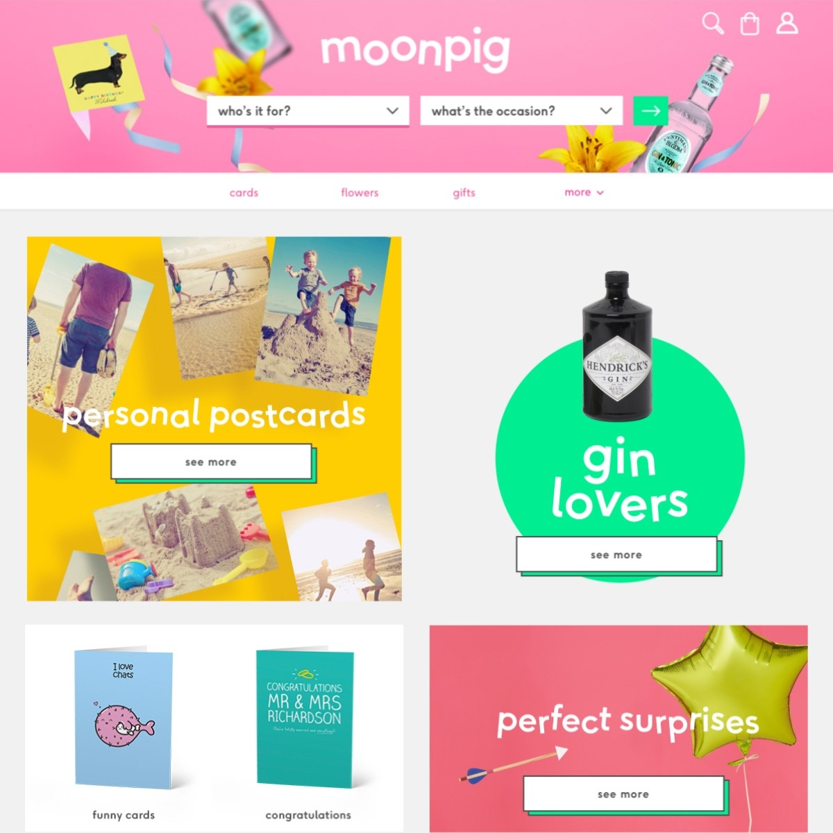
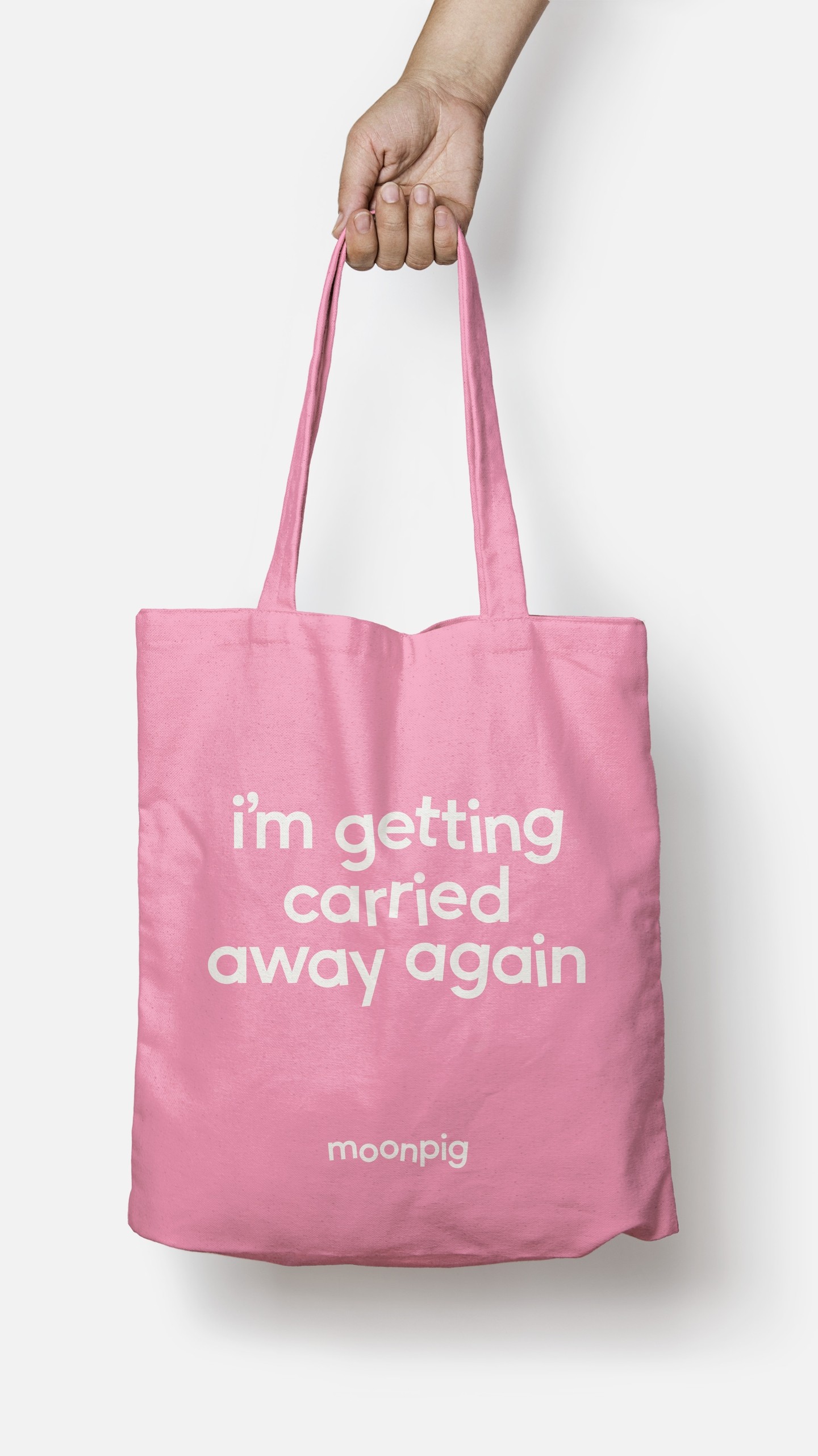
The ambition was to take the weightless signature of the identity all the way through to the user experience, including the website and app. Items float as you scroll, headlines bounce, shake and extend, rewarding you with playful moments as you explore. This all adds up to a sense of fun and playfulness that embodies the brand throughout digital experience.


“The results speak for themselves, S+P’s inside-out approach really captures the essence of a brand in a highly creative way that not only connects with audiences but builds engagement and support across the entire business.”
James Turner, Creative Director, Moonpig
You may like?
Become part of our network
Come and join our collective of diverse thinkers, creatives, and provocateurs. We’d love to hear from you if you’re interested in doing some really great work together.